
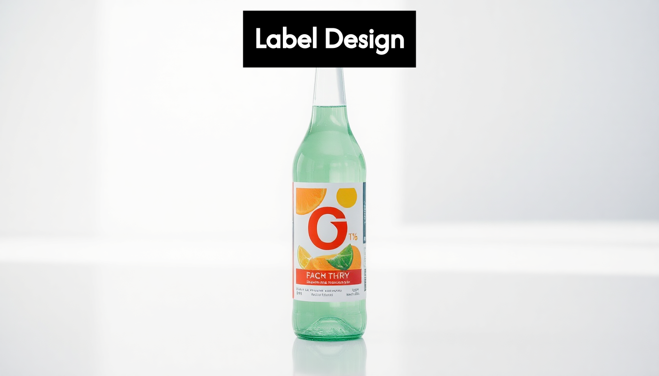
Effective label design can make or break a product’s success. Many overlook how visual hierarchy alone improves information recognition by up to 70 percent. But here’s the surprise: it’s not just about making labels look good. The real game changer is how well your label communicates vital information quickly and clearly—especially in industrial and pharmaceutical settings where precision matters most.
| Takeaway | Explanation |
|---|---|
| Visual Hierarchy is Crucial | Establishing a clear visual hierarchy helps to prioritise information on your label, ensuring that key details command attention and are easily identifiable by consumers or users in industrial settings. |
| Colour Psychology Matters | Strategic colour selection influences consumer perception and should align with brand identity while ensuring readability. High contrast combinations improve visibility, especially in industrial applications. |
| Effective Typography Enhances Readability | Choosing legible fonts that accommodate various viewing distances and remain clear under challenging conditions is essential for both aesthetic appeal and functional communication. |
| Brand Identity Integration is Key | Thoughtfully incorporating brand elements within the label design reinforces recognition and builds trust, particularly in competitive industrial markets where reliability is paramount. |
| Navigating Regulations is Essential | Understanding and designing for legal label regulations is vital; integrating required information from the design onset helps maintain compliance without sacrificing brand presence. |
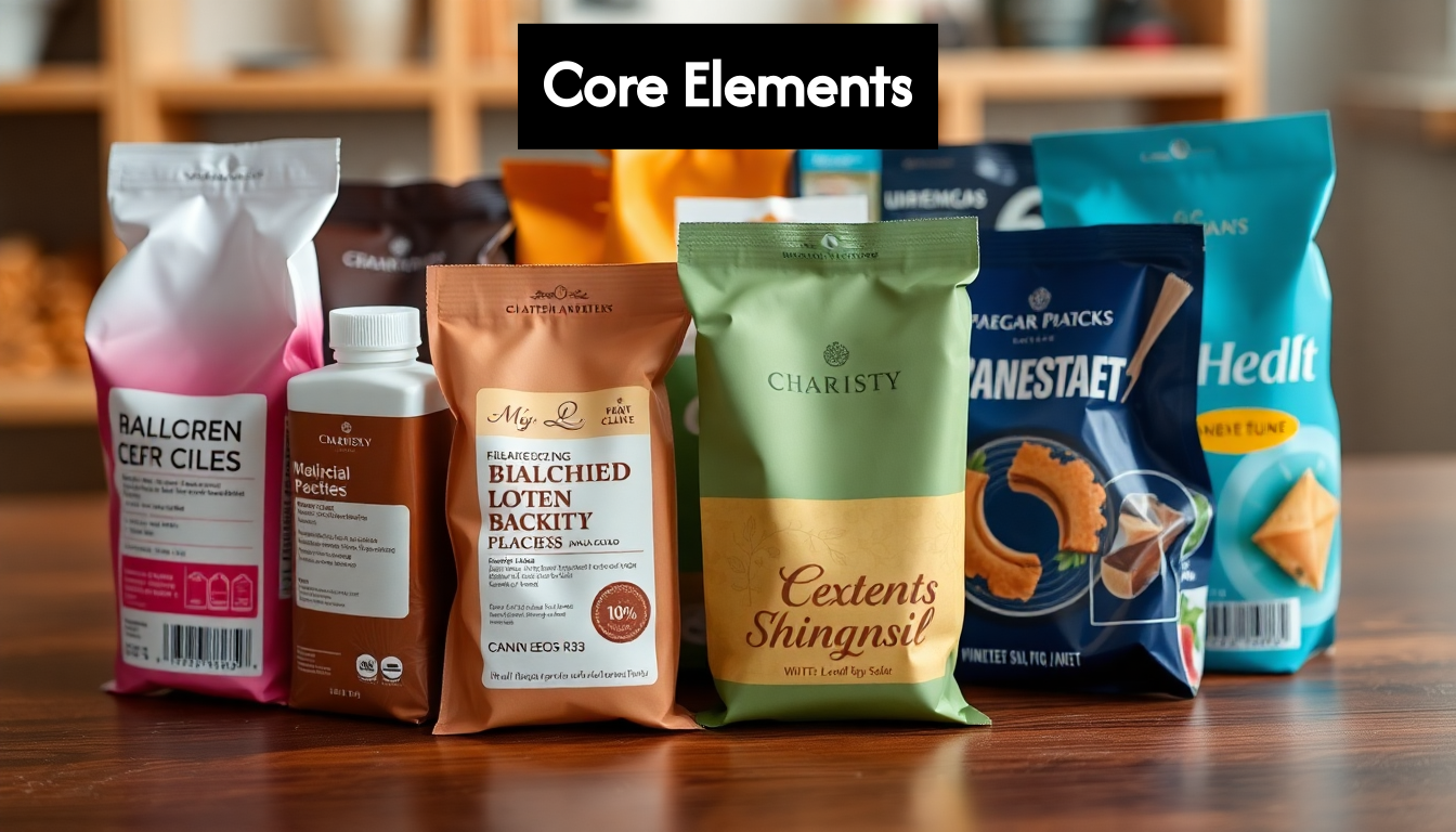
When approaching label design considerations, certain core elements form the foundation of an effective label. These components work together to create a design that is not only visually appealing but also functional and informative. Understanding these essential elements is crucial for anyone involved in product packaging or branding.
Visual hierarchy determines how information is organised and prioritised on your label. It guides the viewer’s eye through the content in order of importance. Effective visual hierarchy ensures that critical information stands out while secondary details remain accessible but don’t compete for attention.
The primary elements—typically your brand name and product identifier—should command immediate attention. Secondary information like product benefits, ingredients, or usage instructions should be clearly visible but subordinate to primary elements. Tertiary details such as barcodes, certifications, and regulatory information need to be included but can be positioned less prominently.
Interestingly, recent research challenges traditional assumptions about label positioning. A comprehensive study involving nearly 800 participants revealed that users actually prefer labels placed above point features, contradicting the conventional top-right placement often used in many design applications research from Frontiers.
Typography choices significantly impact both readability and brand perception. When selecting fonts for your label design, consider these principles:
Limit your design to two or three complementary typefaces maximum. Too many fonts create visual confusion and dilute your brand message. For industrial applications where labels may be viewed in challenging conditions, sans-serif fonts often provide better readability.
Colour selection extends beyond aesthetic appeal—it directly influences consumer perception and behaviour. Your colour palette should reflect your brand identity while considering industry conventions and product expectations.
Different colours evoke specific emotional and psychological responses. Blue conveys trust and reliability, making it appropriate for pharmaceutical or technical products. Green suggests natural or organic qualities, while red draws attention and creates urgency, often used for warnings or promotions.
Colour combinations also affect readability. Ensure sufficient contrast between text and background colours, particularly for essential information. For industrial applications, high-contrast combinations improve visibility in varied lighting conditions, which is vital for safety information or operating instructions.
Graphics, images, and icons serve multiple purposes in label design. They can instantly communicate product features, guide proper usage, or reinforce brand identity. Effective visual elements are purposeful rather than decorative, adding genuine value to the communication.
Consider how visual elements can transcend language barriers, particularly valuable for products distributed internationally. Icons representing usage instructions, hazard warnings, or product features can communicate essential information regardless of the user’s primary language.
But visual complexity requires careful balance. Overly complex graphics may confuse rather than clarify, especially on smaller labels. Each visual element should earn its place by enhancing understanding or reinforcing key messages. This is particularly important in industrial settings where misinterpretation could have serious consequences.
These core elements—visual hierarchy, typography, colour psychology, and visual elements—form the foundation of effective label design. By thoughtfully implementing these principles with your specific audience and usage context in mind, you can create labels that not only attract attention but also communicate effectively and support your broader brand strategy.
Selecting appropriate colours and fonts represents one of the most critical label design considerations for any product. These elements not only define the visual appeal of your label but also significantly impact how effectively it communicates with your target audience.
Colour choices go far beyond aesthetic preferences—they directly influence consumer perception and emotional response. When selecting a colour scheme for your label design, consider both the practical and psychological implications.
Recent research into colour-emotion associations provides valuable insights for label designers. A notable study examining 644 food and beverage companies found specific correlations between logo colours and customer emotions. The research revealed that yellow strongly correlated with happiness, blue with sadness, and bright colours generally with surprise, while red and grey appeared across multiple emotional categories research from arXiv.
For industrial and technical products, colour selection must balance brand identity with practical considerations:
When developing a colour palette, limit your selection to 2-3 primary colours plus neutral tones. A restrained palette creates visual cohesion and strengthens brand recognition. Consider how your colours will reproduce across different printing technologies and substrates, as this can significantly impact the final appearance.
Font selection for labels requires balancing aesthetic appeal with functional requirements. Typography choices communicate subtle messages about your product’s quality, reliability, and positioning.
For industrial applications, readability must take precedence over decorative appeal. Consider these factors when selecting fonts for your label design:
Sans-serif fonts like Helvetica, Arial, or Roboto typically offer superior readability for technical information, especially at smaller sizes. For brand names or headings, you might consider more distinctive typefaces that align with your brand personality, but ensure they remain clear and legible.
The thoughtful combination of colours and fonts establishes a visual hierarchy that guides users through your label’s information. This hierarchy should reflect the relative importance of different content elements.
Brand elements typically occupy the primary position, with product-specific information secondary, and regulatory or technical details tertiary. Use design principles to create visual relationships between these elements:
For procurement officers and production managers evaluating products, clear organisation of technical specifications and compliance information is particularly valuable. These professionals often need to quickly verify compatibility with existing systems or regulatory requirements.
Before finalising colour and font choices, test your design under conditions that simulate real-world usage. Consider factors such as:
For pharmaceutical applications, label clarity directly impacts patient safety. Production managers in this sector require absolute confidence that critical information like dosage, active ingredients, and expiration dates remain clearly legible throughout the product lifecycle.
By approaching colour and font selection as strategic decisions rather than merely aesthetic ones, you create labels that not only look appropriate but also function effectively in their intended environment. This mindful approach to label design principles ensures your products communicate clearly with users while reinforcing your brand identity.
The arrangement of visual elements and text on your label creates the foundation for successful communication. Thoughtful layout and strategic use of imagery are fundamental label design considerations that determine whether your product stands out on shelves or conveys critical information efficiently in industrial settings.
Layout planning begins with understanding the hierarchy of information your label must communicate. While consumers might prioritise brand recognition and product benefits, industrial users often need immediate access to technical specifications, safety warnings, or regulatory compliance indicators.
A well-structured label layout typically follows these principles:
Recent advances in layout planning technology have produced sophisticated tools that leverage artificial intelligence to optimise layout designs. These systems can help determine the most effective arrangement of elements for specific viewing contexts and information priorities. For example, research shows that unified approaches to layout planning and imagery generation can significantly improve how effectively layouts communicate complex information research from arXiv.
For production line managers and procurement officers, a well-organised layout means they can quickly locate critical information like product specifications, compatibility details, or safety protocols. This efficiency becomes particularly valuable in fast-paced industrial environments.
Implementing a grid system provides structure and consistency to your label design. Grids help organise information logically while ensuring proportional relationships between elements. For technical or industrial labels, grid systems are invaluable for maintaining clarity across product ranges.
When developing a grid structure for your labels:
A well-executed grid system becomes invisible to the end user but significantly enhances their ability to locate information efficiently. This is particularly important for production environments where quick identification of product details or handling instructions can impact operational efficiency.
Imagery on labels serves multiple functions beyond mere decoration. Effective images communicate instantly, transcending language barriers and reinforcing brand identity. In industrial contexts, visual elements often serve practical purposes:
While consumer products might use lifestyle imagery to evoke emotional connections, industrial labels typically prioritise functional imagery that enhances comprehension. Diagrams, technical illustrations, or simplified icons often prove more valuable than decorative pictures.
The resolution and reproduction quality of images must align with your printing method and substrate. Vector graphics often provide superior results for technical illustrations, maintaining clarity regardless of scale. For pharmaceutical labels or technical products, precision in visual elements directly impacts user safety and proper application.
The environment where your label will be viewed significantly influences layout decisions. Consider these contextual factors when finalising your design:
For small containers or components, prioritising the most critical information becomes essential, as space limitations force design compromises. In such cases, consider extending information access through digital means like QR codes linking to comprehensive documentation.

Labels for pharmaceutical production must maintain legibility under strict handling protocols and varied lighting conditions. Similarly, labels for industrial machinery parts need to withstand harsh environments while continuing to communicate essential information clearly.
By approaching imagery and layout as strategic communication tools rather than aesthetic elements, you develop label designs that effectively serve their functional purpose while reinforcing brand consistency. This balance between visual appeal and practical utility represents the essence of successful label design principles for industrial and technical applications.
When considering label design principles, successfully integrating brand identity elements transforms a simple information carrier into a powerful brand ambassador. Effective labelling design and branding work in harmony to create recognition, build trust, and communicate your company’s core values through visual and textual cues.
Brand identity encompasses all visual and conceptual elements that represent your organisation’s values, personality, and positioning. Recent research confirms that brand identity serves as a crucial visual representation of an enterprise, reflecting its core values and significantly contributing to its market competitiveness research from ResearchGate.
For industrial and technical products, brand identity typically includes:
These elements work together to build recognition and trust, particularly important in industrial contexts where reliability and performance are paramount concerns. For procurement officers evaluating multiple suppliers, strong brand identity signals consistency and quality assurance.
The positioning of brand identity components on your label requires careful consideration of both visual hierarchy and functional requirements. Your logo should be immediately visible yet appropriately sized for the overall design. Too large, and it overwhelms other critical information; too small, and brand recognition suffers.
For technical or industrial products, consider these placement strategies:
This consistent placement builds visual memory among repeat purchasers, allowing them to quickly locate your products among competitors. For operations managers who regularly order supplies or components, this consistency streamlines procurement processes.
One of the most significant challenges in label design for technical products is achieving the right balance between brand expression and functional information. Industrial and pharmaceutical products often have extensive regulatory and safety information requirements that compete for limited label space.
Successful approaches to this challenge include:
For pharmaceutical production managers, this balance is particularly crucial. Labels must maintain compliance with stringent regulatory requirements while still providing clear product identification through brand elements. This delicate equilibrium requires thoughtful design decisions prioritising both safety and brand recognition.
Consistency across your product range reinforces brand recognition and builds consumer confidence. This is particularly important for manufacturers with extensive product portfolios where customers may use multiple items from your range.
To achieve consistency while accommodating product-specific requirements:
Procurement officers often appreciate this consistency as it allows for quick verification that products come from the same trusted supplier, even when ordering from different product categories.
In industrial settings, brand identity must work harder to maintain visibility and relevance. Your labels may be viewed in challenging environments with poor lighting, exposed to harsh conditions, or handled with protective equipment. These realities should inform your brand expression on labels.
Consider these adaptations for technical environments:
By thoughtfully incorporating these brand identity considerations into your label design process, you create packaging that not only conveys essential information but also builds brand equity with each interaction. For industrial and technical products, this investment in consistent, appropriate branding elevates your offerings from commodities to trusted solutions.
Compliance with legal regulations represents one of the most critical label design considerations for any product. Regulatory requirements vary significantly across industries, product categories, and geographical markets, creating a complex landscape that demands careful navigation.
Regulatory frameworks for product labelling are typically industry-specific, with particularly stringent requirements for products that impact health, safety, or the environment. Understanding which regulations apply to your specific product category is the essential first step in compliance.
For pharmaceutical products, labels must include precise dosage information, active ingredients, contraindications, and storage requirements. Chemical products require hazard symbols, precautionary statements, and emergency response information. Even seemingly straightforward products may have unexpected regulatory requirements based on their composition or intended use.
The fragmented nature of regulatory oversight further complicates compliance. In the United States alone, multiple agencies govern product labelling. As an example of this complexity, research shows that the FDA and USDA share responsibility for food labelling regulations, with the FDA handling most foods while the USDA oversees meat, poultry, and eggs research from St. John’s Law Review.
Despite variations across industries and regions, several core components typically appear in regulatory requirements:
For industrial procurement officers and operations managers, these components provide critical information for safe handling, proper usage, and efficient inventory management. Clear presentation of this information supports operational efficiency while ensuring regulatory compliance.
Products distributed across multiple markets face the challenge of meeting different—and sometimes contradictory—regulatory requirements. What’s mandatory in one region may be prohibited in another, creating significant design challenges for global products.
Common regional variations include:
International distribution often necessitates creative solutions such as multi-panel labels, expanded content labels, or market-specific packaging variations. For pharmaceutical production managers handling global distribution, these variations directly impact production line setup and quality control processes.
Successful label design integrates regulatory requirements from the earliest planning stages rather than attempting to retrofit them into an existing design. This approach ensures that mandatory elements receive appropriate prominence and space allocation.
Consider these strategies when designing for regulatory compliance:
Products in highly regulated sectors like pharmaceuticals often benefit from early consultation with regulatory specialists who can review designs before significant resources are invested in production.
Perhaps the greatest challenge in regulatory compliance is balancing legal requirements with effective brand communication. Mandatory elements can consume significant label space, potentially overwhelming brand elements and product differentiation.
Strategic approaches to this challenge include:
For product development engineers and procurement officers, understanding these balancing principles helps manage expectations regarding brand expression within regulatory constraints.
Navigating label regulations successfully requires both technical knowledge and creative problem-solving. By approaching compliance as an integral part of the design process rather than an obstacle, you can create labels that satisfy legal requirements while still effectively communicating your brand identity and product benefits.
The key elements of label design include visual hierarchy, typography, colour psychology, and visual elements. These components work together to ensure that the label is both visually appealing and informative.
Colour selection significantly affects consumer perception and readability. Strategic colour choices can evoke specific emotions and draw attention to important information, making them crucial for effective label design.
Typography is vital for readability and conveying brand identity. Choosing clear, legible fonts that work well in various viewing conditions ensures that essential information is easily accessible to consumers or users in industrial settings.
When designing labels for regulatory compliance, consider industry-specific requirements, essential compliance components, regional variations, and how to balance compliance measures with brand identity to ensure clear communication.
Are you tired of the uncertainties that come with inefficient labelling? It’s time to elevate your product success with precision and consistency. As highlighted in our article, effective label design hinges on factors like visual hierarchy, typography, and compliance—but what good is a well-designed label if your application process fails to meet these standards?

At Sessions UK, we provide tailored labelling solutions that empower you to maintain accuracy and speed in your production lines. Our semi-automatic and fully automatic labelling machines are engineered for maximum performance, helping businesses like yours avoid costly errors and meet regulatory compliance with ease.
Don’t let your products go unnoticed! Boost your brand, streamline your operations, and ensure your labels communicate effectively. Visit Sessions UK today to discover the right labelling machine for your unique needs and experience the difference that professional-grade labelling can make!

Learn how an RFID clothing tag can streamline retail operations and boost inventory accuracy. Discover benefits and implementation tips today.

Discover how asset tracking labels work for UK businesses. This guide covers barcode vs. RFID, materials, and how to build your asset management system.

A practical guide to labelling glass jars. Learn about machines, adhesives, and UK compliance to get a professional finish for your products.
Copyright © 2026 Sessions Label Solutions Ltd.