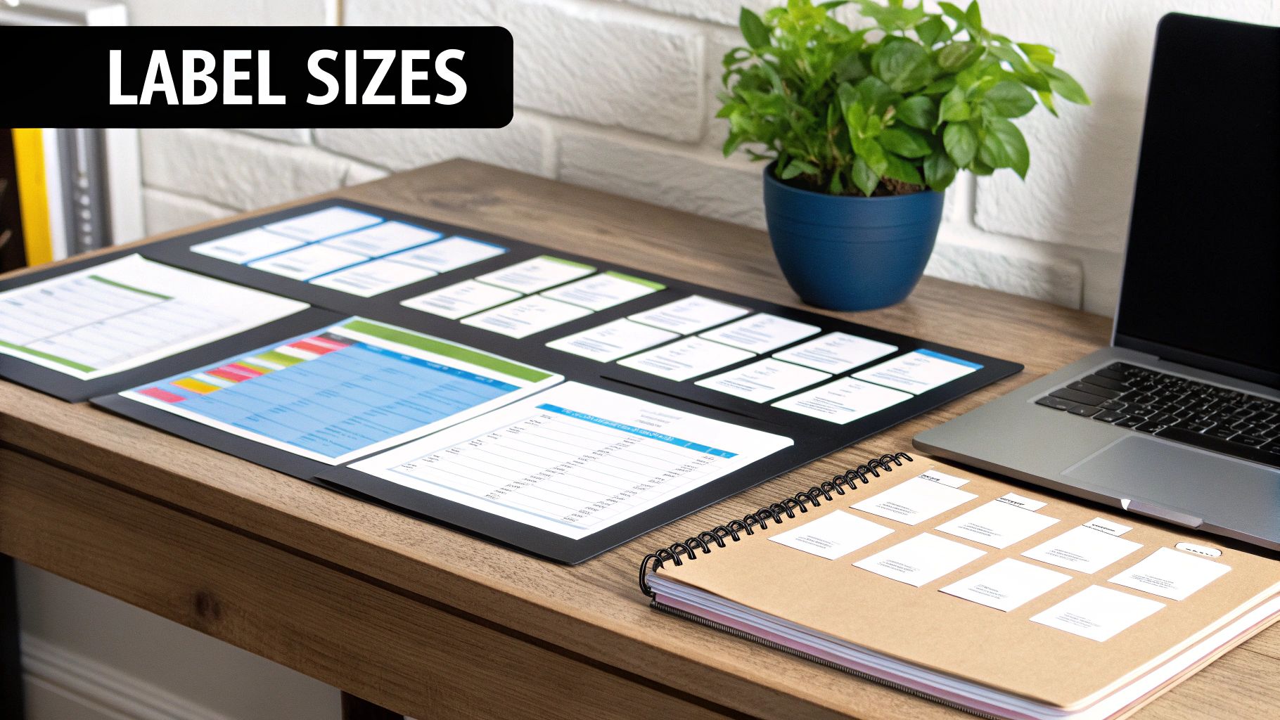
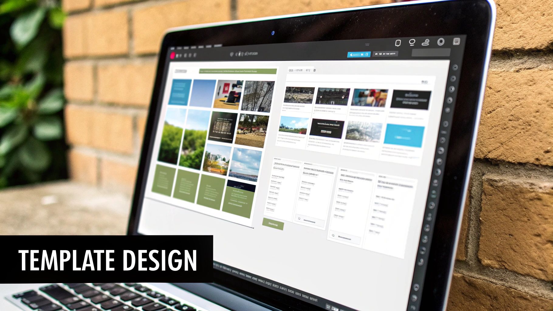
A solid print on labels template is the foundation of any labelling project. Think of it as a precise map for your printer. It’s the blueprint that tells your design exactly where to land on the physical label sheet, saving you from the headache of misprints and wasted stock.

Getting this first step right is everything. The correct template makes sure your text and graphics sit perfectly centred on each label, preventing off-kilter results or, worse, chopped-off designs. It all boils down to finding the perfect match for your label sheets and what you’re trying to achieve.
So, where can you get your hands on one?
The quickest way to get started is by finding the product number on your label packaging. This code- something like “Avery 5160”- is the key. It corresponds to a very specific layout with exact dimensions. Simply searching for this number is the most foolproof way to find a template that will work perfectly.
No product number? No problem, but you’ll have to do a little legwork. Get a ruler and manually measure your label sheet. You’ll need the height and width of a single label, the number of labels across and down, and the margins on all four sides of the sheet. These details are needed for finding a compatible template or even creating your own from scratch.
A common pitfall I see is people assuming all “30-up” sheets (3 columns of 10 labels) are the same. They aren’t. The tiny differences in spacing and margins between manufacturers can cause your alignment to drift down the page. Always stick to the template made for your specific brand and product number.
The type of label you’re using matters, too. For instance, if you’re labelling shampoo bottles that’ll live in a humid bathroom, you’d choose a durable polyester label. The template you use needs to match that specific product code. For a simple run of mailing addresses, a standard paper label template will do just fine.
Finally, consider the file format. The best template is one that plays nicely with the software you’re comfortable with. You can find a complete guide to software for labels printing to help you pick the right tool for the job. Templates often come in formats like .docx for Word or .ai for Adobe Illustrator. Choosing a format you already know will make the whole customisation process feel much less like a chore.
https://www.youtube.com/embed/X_PiOVyOs3Y
You’ve got your template file ready to go. The next step is getting your software dialled in. It’s tempting to jump straight into designing, but I’ve seen it time and time again: skipping these initial checks is the number one cause of misaligned prints and a bin full of wasted label sheets.
Spending just a few minutes here will save you a world of frustration later. It’s what separates a professional-looking batch of labels from a messy, unusable pile.
First, make sure your document’s page settings perfectly match the physical label sheet you’re holding. Here in the UK, that’s almost always going to be A4. You’ll also want to double-check the page orientation. Most templates are set up for a standard portrait (vertical) layout, but some, particularly odd shapes like CD labels, might need a landscape (horizontal) orientation.
Once that’s sorted, you can confidently open or import your chosen template.
Think of your screen now as a digital twin of your label sheet. To keep everything neat and tidy, you need to use the tools at your disposal. This is where rulers and guides become your best friends. Pop into the ‘View’ menu in whatever program you’re using- whether it’s Word or a design app- and switch on the rulers. While you’re there, enable the guides or gridlines too.
Don’t worry, these visual aids are just for you; they won’t show up on the final print. They act like invisible fences, showing you the exact boundaries for each label. This makes sure your text and images don’t accidentally creep over into a neighbour’s space.
One of the most common pitfalls I see is people forgetting about the bleed area. If your design has a background colour or an image that touches the very edge of the label, you must extend it slightly beyond the label’s border in your design. This small overlap, known as a bleed, compensates for any tiny shifts in the printer and prevents ugly white gaps from appearing at the edges. A 3mm bleed is a good, safe standard to work with.
Before you begin the creative part, it’s worth running through this quick checklist. Taking a methodical approach now helps you spot and fix potential problems before they waste your time and materials.
| Setting | What to Check | Why It Matters |
|---|---|---|
| Page Size | Confirm it matches your label paper (e.g., A4). | An incorrect page size scales the entire template grid wrongly, throwing everything out of alignment. |
| Orientation | Is it set to Portrait or Landscape to match the template? | A mismatch will print your design sideways across the labels, which is a classic, frustrating mistake. |
| Guides/Grid | Are they switched on and aligned with the template? | These are your on-screen boundaries, useful for keeping your design perfectly contained within each label. |
| Bleed Area | Have you extended edge-to-edge designs past the border? | This is your insurance against those annoying white slivers appearing at the edges after printing. |
Getting these software fundamentals right from the start makes the whole process so much smoother. For certain jobs, like creating compliant food packaging, this setup isn’t just good practice- it’s required. You can learn more about the specifics of food labelling printers to see how the right hardware and software setup come together for specialised tasks.

A great label is so much more than a bit of sticky paper; it’s your silent salesperson. It’s what grabs a customer’s eye, tells your brand’s story, and can be the deciding factor in a purchase. When you start to print on labels template files, you’re not just printing info – you’re creating a first impression.
The secret to a knockout design is clarity. Your most important information needs to jump off the label. This all comes down to a clever visual hierarchy, where you use size, colour, and positioning to guide the viewer’s eye exactly where you want it to go. What’s the very first thing your customer needs to know? Make that the star of the show.
Building a visual hierarchy isn’t just about making your logo bigger. It’s about arranging every element so the label is understood in a split second. A food label, for instance, has to make ingredients and allergy warnings impossible to miss, whereas a label for a handmade soap might put the unique scent and brand name front and centre.
To get your hierarchy right, focus on these key elements:
Here’s a simple trick I always use: print a draft of your label, stick it on your product, and take a few steps back. Can you still read the most important text? If the product name vanishes into the background, you know your hierarchy needs a rethink.
Designing for a small space is a real challenge. Every single millimetre matters, so you have to be efficient and ruthless with your design choices. It’s a constant balancing act between packing in needed details and keeping the look clean and uncluttered.
A perfect example is the detailed craft that goes into printing labels for beer bottles, where branding, legal text, and creative flair all have to coexist in a very defined area.
Here are a few pointers I’ve picked up for making small-scale designs effective:
Your design looks brilliant on screen, but the real magic happens at the printer. This is the moment your digital creation becomes a tangible label, and getting the printer settings spot-on is what separates a professional result from a frustrating pile of misprints.
Before you even think about loading your expensive label sheets, grab a piece of plain A4 paper. Trust me on this. A quick test print on standard paper is the smartest, fastest way to check your print on labels template alignment without wasting a single label. Just print one page, hold it up against a label sheet in front of a window, and you’ll see instantly if everything is lining up correctly.
When you hit ‘Print’, don’t just click ‘OK’. You need to go into the ‘Printer Properties’ or ‘Advanced Settings’ menu. This is where you tell your printer exactly what you’re trying to do.
Every printer is a bit different, but you’re looking for a few key options:
The demand for high-quality, customisable labels is booming. The UK’s digital label printing market is expected to see a 7.9% annual growth rate through 2035, driven by businesses needing more flexible and precise labelling. You can read more about the trends in the UK digital label printing market.
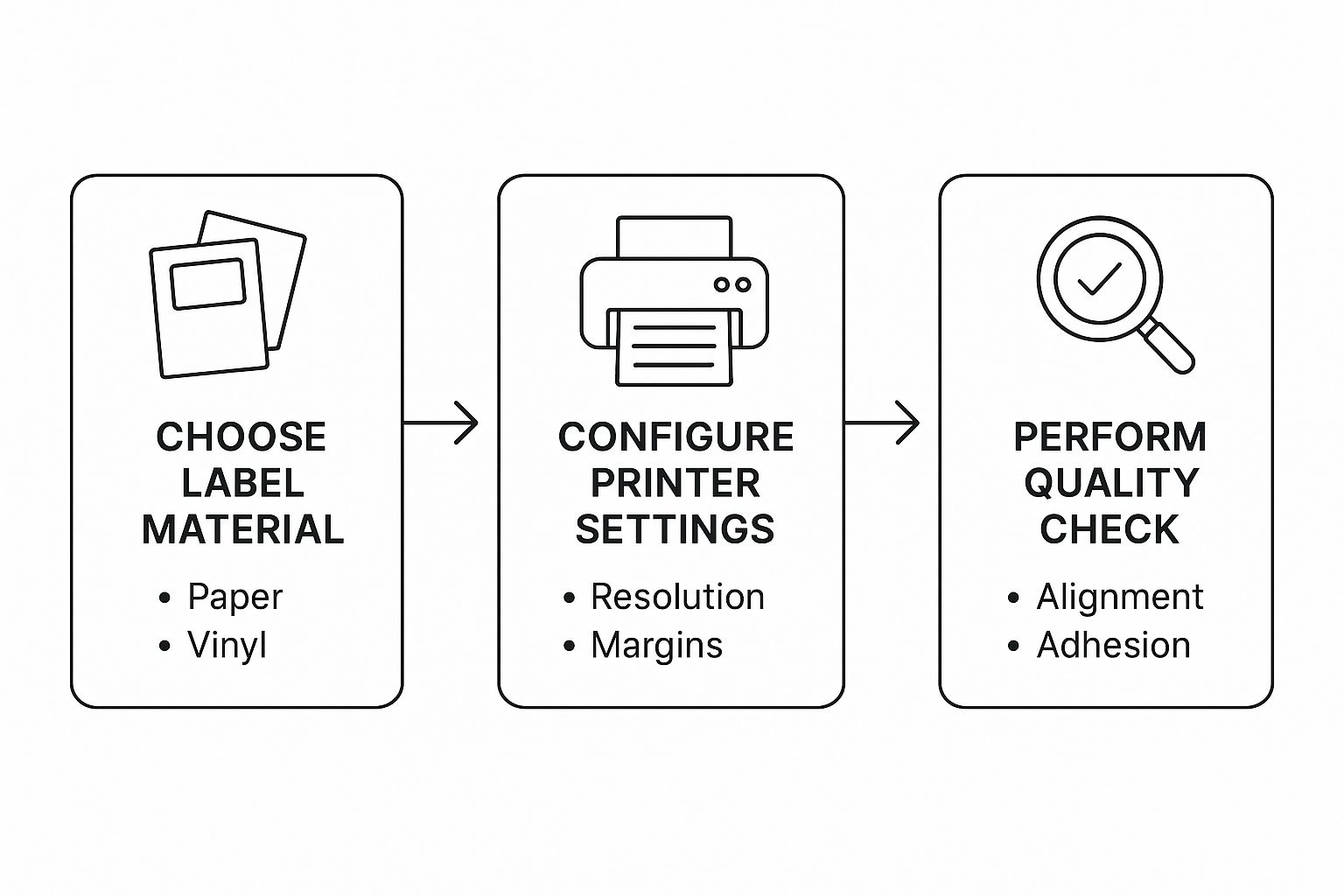
This process flow visualises the key stages involved in producing top-notch labels, from choosing your materials right through to the final quality check.

As you can see, your choice of label material has a direct impact on the printer settings you need, which is fundamental to passing those final quality checks.
With your settings dialled in, it’s time for that critical A4 test.
If your printer has a manual feed tray, use it. Loading a single sheet of plain paper here often gives you a straighter path through the printer, which helps prevent any slight skewing.
Now, print just a single copy of your label document.
Once it’s out, grab the printed page and a fresh sheet of your actual labels. Hold them together and put them up against a bright window or another light source.
You’re looking for a perfect match. Does each design sit neatly within the pre-cut label shape? If things are off by a millimetre or two, don’t worry. This is easy to fix. Just go back into your software and make tiny adjustments to the page margins. A small tweak can nudge the whole grid into perfect alignment.

Even with the most careful setup, sometimes things just don’t go to plan. You hit ‘print’, and what comes out is a sheet of slightly off-centre, smudged, or disappointingly coloured labels. It’s a common hiccup, especially when you first get started, but the good news is that most issues are surprisingly simple to fix.
This guide is your go-to resource for turning printing frustration into a professional finish. We’ll walk through the most frequent troubles and give you direct, practical solutions.
This is the big one. Your design looks perfect on screen, but when it prints, it’s just a little bit off, spilling over the edge of the label. This almost always comes down to how the printer feeds the sheet or a tiny discrepancy in the software settings.
Before you start getting frustrated and redesigning the whole template, try making small software adjustments first. Pop into your document’s page setup and just tweak the top or left margins by 1mm or 2mm. This tiny nudge can often be all it takes to shift the entire print grid into the correct position.
Always print another test on plain paper to check your work before committing to another full sheet of labels.
Ever designed a label with a beautiful, rich blue on screen, only for it to print out as a dull, muted navy? This classic colour mismatch between your monitor and your printer is a common challenge.
The root of the problem lies in how screens and printers handle colour. Your screen creates colours by mixing light (RGB – Red, Green, Blue), while your printer uses ink (CMYK – Cyan, Magenta, Yellow, Black). They are fundamentally different systems.
To get them to play nicely, here are a few things you can try:
A Quick Tip from Experience: Don’t overlook the paper itself. The finish on your label sheet- whether it’s matte, semi-gloss, or high-gloss- has a massive impact on how colours appear. A glossy finish will nearly always make colours look richer and more saturated than a standard matte paper.
Ink smudging is often just a simple case of using the wrong printer settings for your label material. If you’re printing on something like glossy or vinyl labels, the ink needs more time and heat to dry and properly bond to that slicker surface.
Before you print, always check your printer properties and select the correct media type, such as ‘Glossy Paper’ or ‘Labels’. This small change tells the printer to adjust its speed and temperature, which dramatically reduces the chance of smudges. For more great advice on getting it right, have a look at these tips for efficient labelling.
It’s also worth seeing how material choices are changing. With the UK’s label market projected to hit £18 billion by 2025, sustainability is a huge factor. Businesses are increasingly opting for materials like plant-based films and compostable adhesives, which might require their own specific printer settings to get a perfect, smudge-free result.
When you’re working with label templates, a few common questions tend to pop up. Let’s get them sorted so you can crack on with your project without any hitches.
I wouldn’t recommend it. It’s a common trap to fall into – two A4 sheets, both with 24 labels, look identical to the naked eye. But the reality is that tiny, almost invisible differences in the margins or the gutter (the space between labels) can throw your entire print run out of whack.
For results you can rely on, you really need to use the specific print on labels template that matches the product number on your label packaging. It’s the only way to be certain everything lines up perfectly.
That really comes down to the software you’re comfortable with. There isn’t one “best” format, just the right one for your tool of choice.
This is a classic sign that your design is missing a ‘bleed’. If your design is meant to go right to the edge of the label, you need to extend the background colour or image slightly past the label’s border in your design file. We’re not talking much – just 2-3mm is usually enough.
This little overlap acts as a safety net. It means that if the printer alignment is off by a fraction of a millimetre, you won’t get any frustrating white slivers showing up on your finished labels.
A quick pro tip: Always double-check your printer settings before you hit print. Make sure any options like ‘Scale to Fit Page’ are turned off. Ticking this box will shrink your whole design, completely ruining the template’s alignment and causing those very borders you’re trying to avoid.
Absolutely, but with one critical piece of advice: always do a test print on plain paper first. Things change. Your printer’s software might have updated, or you might have tweaked a setting without realising it.
A quick test run on a cheap sheet of A4 will confirm if your old template still lines up correctly before you start using your actual label sheets. A good habit to get into is saving a blank master copy of any template you use frequently. That way, you can start each new design from a clean slate without worrying about accidentally messing up your original layout.
When you’re ready to move from printing sheets to your entire production, Sessions UK provides a full range of industrial labelling machinery. See how we can help automate your process by visiting us at https://sessionsuk.com.
Copyright © 2026 Sessions Label Solutions Ltd.