
Picture this: a customer is standing in front of a wall of beer, faced with dozens, if not hundreds, of choices. What makes them reach for one bottle over another? More often than not, it’s the label. Your beer bottle label is your brand’s first handshake, a visual introduction on a very crowded shelf. It’s the one shot you get to communicate your brewery’s story, quality, and character before they even take a sip.
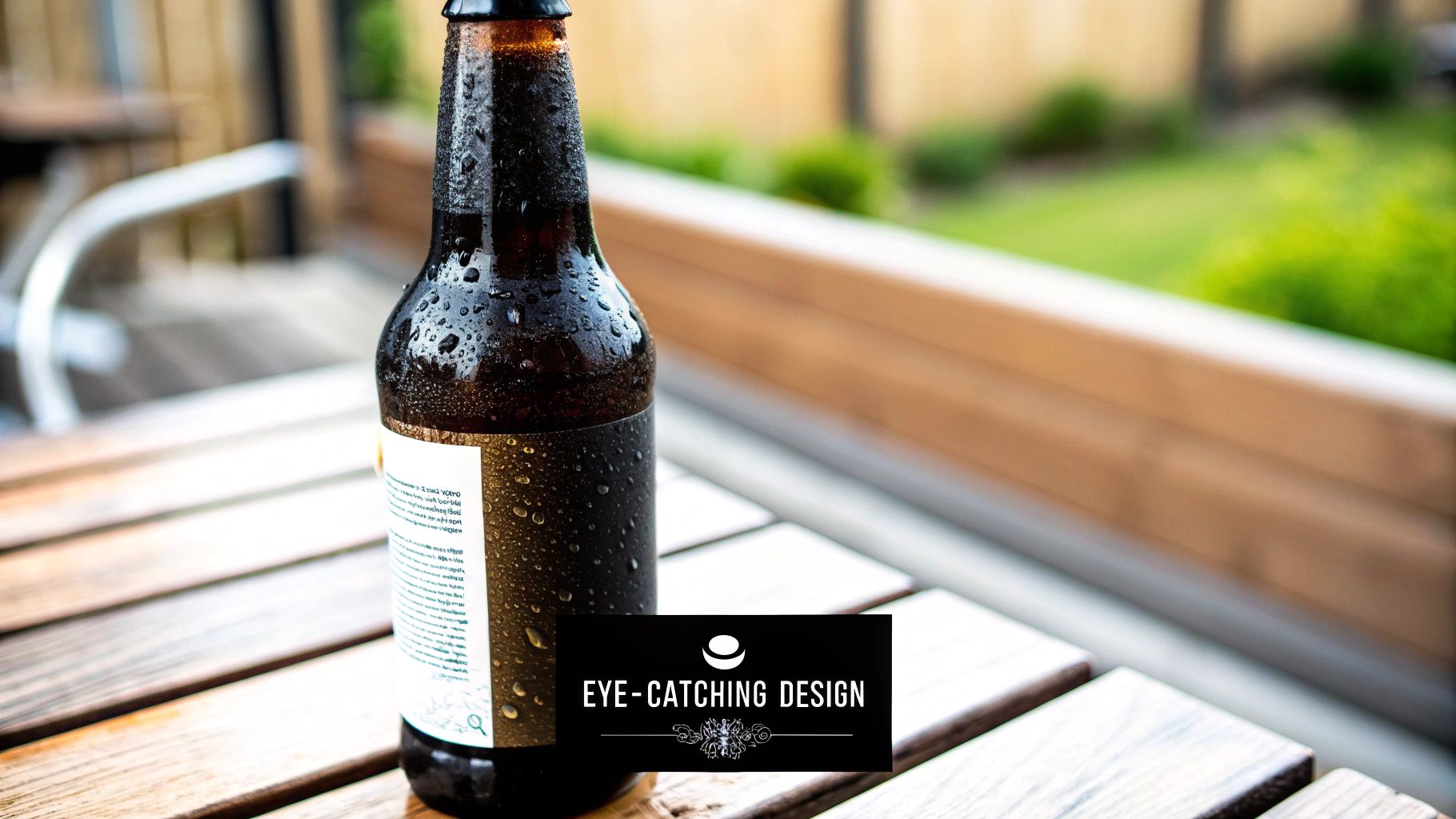
Think of your label as your best salesperson, working silently and tirelessly in the retail aisle. In the few seconds a customer spends scanning their options, your label has to do all the heavy lifting. It needs to stand out, hint at the flavour inside, and give a sense of your brand’s personality. A great label doesn’t just get noticed; it connects with the right person and turns a casual browser into a new fan.
This connection is all about visual storytelling. The colours, fonts, and imagery you choose combine to paint a picture. A clean, minimalist design might suggest a crisp, refreshing lager, whereas a label bursting with bold illustrations could signal an adventurous, hop-forward IPA. The real goal is to create a design that’s true to the spirit of your brewery and the beer in the bottle.
Great beer label design is more than just pretty graphics; it’s an application of consumer psychology. Every design choice you make can trigger specific feelings and expectations in a potential buyer.
For example, warm colours like deep reds and oranges often bring to mind richness and warmth, making them a natural fit for malty stouts or cosy winter ales. Cool blues and greens can suggest something crisp and refreshing, perfect for a pilsner or a light-bodied pale ale.
The fonts you use matter just as much. A classic serif font can convey a sense of tradition and heritage, attracting drinkers who love timeless, well-established styles. A modern sans-serif font or a custom hand-drawn script can signal a contemporary, craft-focused brewery that loves to experiment.
The best labels forge an instant emotional connection. They make the customer feel something-be it curiosity, nostalgia, or excitement-and that feeling is often the tipping point for making a purchase.
While a single standout label is a fantastic start, building a truly recognisable brand demands consistency across your entire beer range. When all your labels share a common visual thread, customers can spot your beers in an instant, even when you launch a new seasonal brew or a limited-edition special. This consistency builds trust and makes it simple for your loyal followers to find what they’re looking for.
To keep your branding tight, focus on a few key elements:
By locking in these visual cornerstones, your beer bottle labelling evolves into a powerful tool for building an identity that not only looks great but also holds its own in a fiercely competitive market.
Creating a label that really jumps off the shelf is about more than just a cool picture. It’s a careful balance between art and information. Your goal is to design something that not only catches the eye but tells your brewery’s story and gives a potential customer everything they need to know in a single glance.
A truly effective label design knows how to lead the eye. This comes down to a strong visual hierarchy, which is a way of saying you arrange things in order of importance. Your brewery’s name and the beer’s name should be the stars of the show, followed by details like the beer style and alcohol by volume (ABV).
Getting this right stops the label from becoming a cluttered mess. It helps a customer quickly figure out what they’re looking at, making their decision to grab your bottle that much easier. Without that clear structure, even the most stunning artwork can get lost in a sea of competing text and graphics.
Your label’s colour palette is a surprisingly powerful tool for setting expectations. Colours can subconsciously hint at flavour profiles and the overall vibe of the beer. Think about it: a rich, malty stout often uses deep browns, blacks, and reds to signal warmth, while a crisp, zesty sour might use bright greens, yellows, or pinks to scream refreshment.
Typography is just as critical. The fonts you choose have to be legible from a shelf and a perfect fit for your brand. A brewery with a long history might lean towards a classic serif font to convey heritage. A modern craft brewery could go for a clean, sans-serif font or even a custom hand-drawn script to show off its unique personality.
A great beer label translates your brewery’s spirit into a compelling visual narrative. It’s the balance between artistic freedom and the practical need to inform, making certain that details are clear without overwhelming the design.
It can also be useful to look at how other drinks producers tackle this. For instance, exploring what elements are crucial for a wine label can offer fresh ideas on design and how to present information effectively.
The biggest challenge in beer labelling is finding that sweet spot between a captivating design and all the legally required info. Your artistic vision has to live happily alongside practical details like beer style, ABV, and volume. The secret is to integrate these elements, not just slap them on as an afterthought.
Here are a few tips to get that balance right:
The push for clear information has a long history. Back in 1960, bottled beer accounted for about 40% of all beer drunk in the UK. This was well before ABV labelling was mandatory, but consumer groups like CAMRA, founded in 1971, campaigned hard for more transparency, pushing for clear distinctions between ‘real ale’ and other types of beer.
Your label design acts as a beacon for your ideal customer. An experimental, hop-forward IPA with a wild, illustrative label will pull in adventurous craft beer fans. A classic bitter with a refined, traditional design will attract drinkers who appreciate timeless quality. Your label is the first signal you send, so make certain it’s calling out to the right people.
While a knock-out design gets your beer noticed on a crowded shelf, it’s the legal stuff that keeps it there. Getting your head around the rules for beer bottle labelling in the UK is a must for every single brewery, whether you’re a small-batch artisan or a major producer. These regulations aren’t just red tape; they’re there to keep consumers safe and informed.
Get it right, and you build trust and avoid the headache of reprinting thousands of labels or, worse, having your product pulled. The rules cover everything from the beer’s official name to allergen warnings. Nailing this from day one shows you’re a professional, responsible brewer who respects your customers.
For any beer to be sold in the UK, a few non-negotiable bits of information must be on the label. This info needs to be clear, easy to spot, and simple to understand. It’s the functional backbone of your label design.
These legal requirements are there to standardise how beers are presented, so people can make informed choices without having to be a Cicerone. The list is very specific, and there’s no wiggle room. Miss one detail, and you could find yourself in hot water with Trading Standards.
“A legally compliant label is the foundation of consumer trust. It demonstrates a commitment to transparency and quality that goes beyond the beer itself, showing respect for both the customer and the regulations that govern the industry.”
To make things crystal clear, here’s a quick-reference table outlining exactly what you need to include on your beer labels to stay on the right side of UK law.
| Required Element | Description and Purpose |
|---|---|
| Product Name | The legal name of the drink (e.g., “Beer,” “Pale Ale”). It must accurately describe what’s inside the bottle. |
| Net Quantity | The volume of beer in the bottle, clearly stated in millilitres (ml) or litres (L). |
| Alcohol by Volume (ABV) | The alcoholic strength shown as a percentage to one decimal place, followed by “% vol.” (e.g., 4.5% vol.). |
| Allergen Information | Highlights any of the 14 major allergens present. For beer, this almost always means cereals containing gluten, like barley, wheat, or oats. |
| Best-Before Date | The date up to which the beer is expected to keep its intended quality, flavour, and fizz. |
| Producer’s Name and Address | The name and address of the business operator responsible for the beer, allowing traceability. |
Think of this table as your final pre-print checklist. Running through it confirms you haven’t missed any of the parts required by law.
Once you’ve ticked all the legal boxes, you can start adding the details that improve the customer experience. This is where you can show you’ve really thought about how someone will enjoy your beer.
Consider adding a few of these extras:
These thoughtful touches can turn a simple label into a conversation starter. For a more detailed look at the wider regulations that could affect your production line, our guide to understanding label regulations for production teams is a great resource. It’s these extra details on your beer bottle labelling that can really set you apart.
Before anyone tastes your beer, they experience the label. It’s the first handshake, the initial impression that whispers (or shouts) about the quality of what’s inside. The material you choose isn’t just a backdrop for your design; it’s a fundamental part of that experience. Getting this right means finding the sweet spot between looks, durability, and cost to reflect your brand’s character and the journey your beer will take from your brewery to a customer’s fridge.
Think about it: a label that peels, wrinkles, or fades in a cold, damp ice bucket can make even the most incredible craft beer look second-rate. That’s why getting to grips with the properties of different materials is so important.
For most breweries, the choice comes down to three main contenders: paper, polypropylene (PP), and polyethylene (PE). Each has its own distinct personality and purpose.
If you want to look deeper into the world of substrates, our guide to the best materials for labels is a great resource to help you choose with confidence.
To help you weigh your options, here’s a quick breakdown of how these common materials stack up against one another.
| Material Type | Key Characteristics | Best For |
|---|---|---|
| Paper | Cost-effective, traditional feel. Available in coated (smooth) and uncoated (textured) versions. Can be vulnerable to moisture without a protective finish. | Traditional ales, rustic brands, dry environments, or short-term promotions where cost is a major factor. |
| Polypropylene (PP) | Highly durable, waterproof, and oil-resistant. Available in clear, white, or metallic finishes. Great for sharp, high-end graphics. | Beers that will be refrigerated or placed in ice. Ideal for premium brands wanting a modern, resilient look. |
| Polyethylene (PE) | Soft and flexible, conforming easily to curved or squeezable bottles. Offers a smooth, clean appearance. | Uniquely shaped bottles, achieving the “no-label” look with clear material, or any container that needs a flexible label. |
As you can see, your choice really depends on the story you want to tell and the environment your bottle will live in.
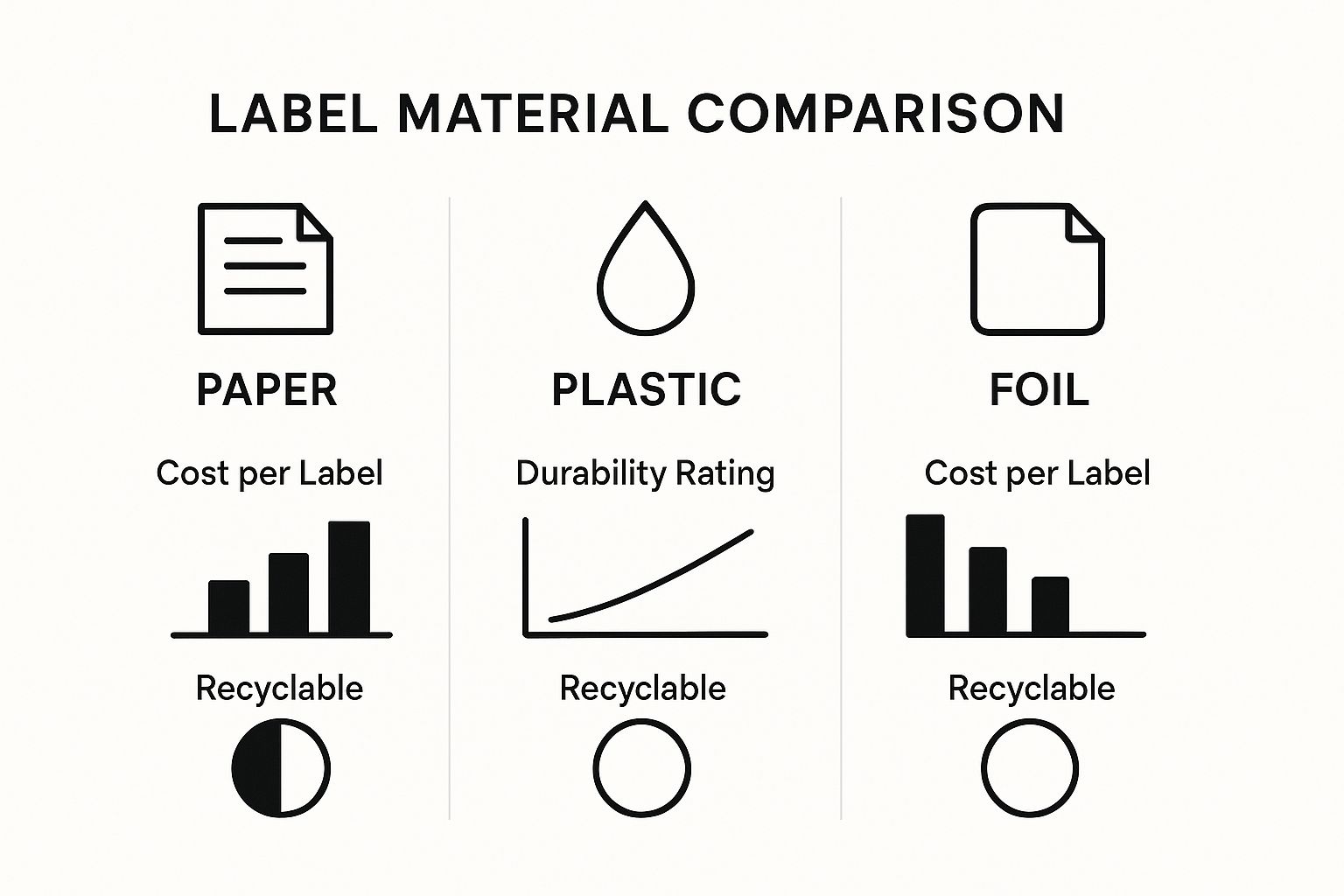
The bottom line is that while paper is easy on the wallet, plastic-based materials offer far superior durability for a modest increase in cost, making certain your brand looks its best right to the last drop.
The adhesive is the unsung hero holding your entire label strategy together. The right glue makes certain your brand’s identity stays firmly in place through the rigours of shipping, storage, and handling.
Don’t overlook this choice. The adhesive is every bit as critical as the label material itself for the overall performance of your beer bottle labelling.
Finishes are where you can really start to have fun. These special techniques are what can elevate a good label into a truly great one, adding visual flair and a tactile quality that makes your bottle feel more luxurious.
A finish isn’t just a protective layer; it’s a sensory detail that shapes how a customer perceives quality. A textured varnish or a flash of foil can make a bottle feel special, something worth a higher price point.
Some of the most popular finishing options include:
These finishing touches, combined with the legally required information, complete your label. Remember that regulations like the UK Food Labelling Regulations 1996 mandate that key details like ABV, best-before dates, and net content are clearly displayed. This confirms your customers get the accurate information they need to make a confident purchase.
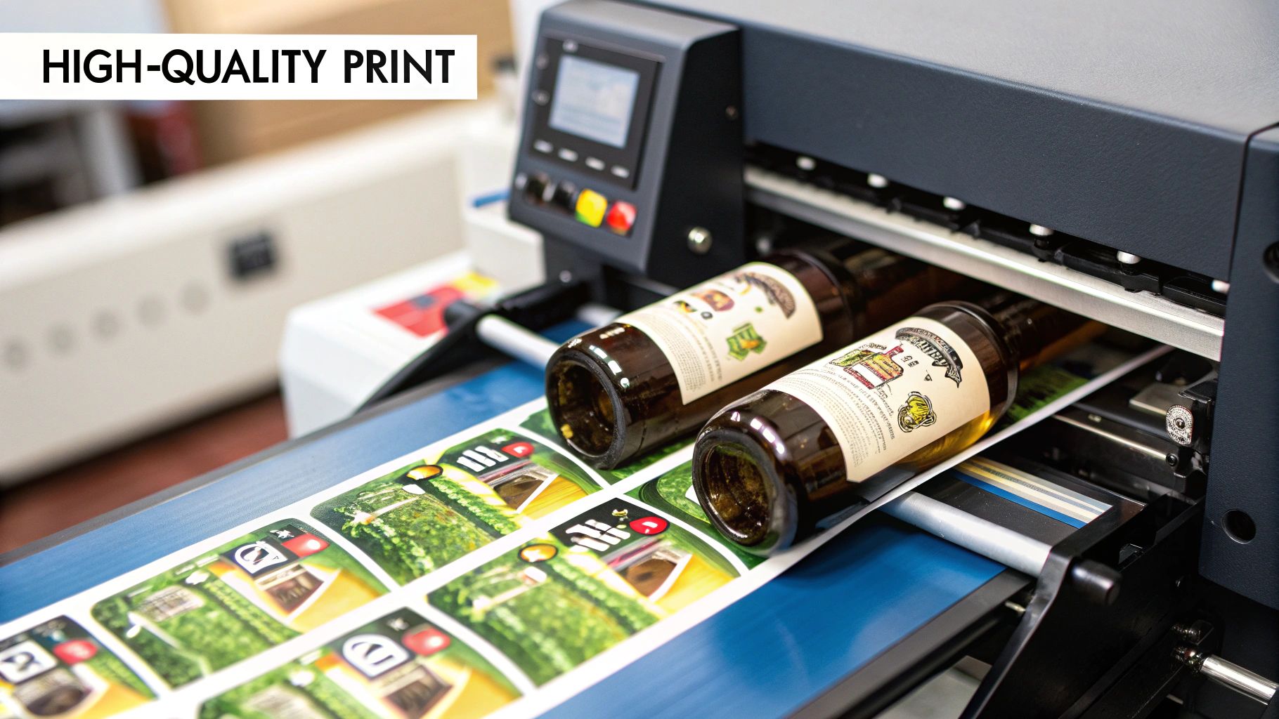
When your brewery starts to take off, that once-charming task of sticking labels on by hand quickly becomes a major production bottleneck. This is the point where investing in proper beer bottle labelling machinery isn’t a luxury; it’s a step towards scaling up. The right machine doesn’t just speed things up-it brings a level of consistency and a professional finish that hand-labelling can rarely touch.
Choosing the right kit means taking a hard look at your current output, where you want to be in a few years, and what your budget can handle. For a tiny start-up, a simple manual applicator might do the trick. But if you’ve got your eyes on wider distribution, a more serious system is a must-buy. The trick is to find a solution that works for you today but won’t hold you back tomorrow.
Labelling machines generally fall into three camps, each built for a different scale of operation. Getting your head around the differences is the first step to making a smart choice for your brewery.
A huge part of investing in good machinery is its ability to make your day-to-day more efficient. When you automate repetitive tasks, you free up your team to focus on what really matters-brewing great beer.
Beyond just the type of machine, a few technical details should guide your decision. Thinking through these points will help you land on equipment that fits your products and workflow like a glove. Your choice of label machines for bottles needs to match both your packaging and your operational reality.
First up is labelling speed, which is typically measured in bottles per minute (BPM). Be honest about what you need right now, but also have a think about your production targets for the next couple of years. A machine that seems perfectly adequate today could become a frustrating bottleneck down the line.
Another massive consideration is bottle compatibility. Are you using standard round bottles, or do you have tapered, square, or other funky shapes in your line-up? Not all labellers can handle everything, so you absolutely must confirm the machine can manage your entire range of bottles. Also, check if it can apply front, back, and neck labels if that’s part of your brand’s look.
“Choosing a labelling machine is about more than speed; it’s about future-proofing your production line. A machine that handles various bottle shapes and label types gives you the creative freedom to evolve your branding without needing to reinvest in new hardware.”
How a machine applies a label is just as important as how fast it does it. The technology behind the application dictates the kind of labels you can use and, ultimately, the final look of your product on the shelf.
| Application Technology | How It Works | Best For |
|---|---|---|
| Pressure-Sensitive | Works with self-adhesive labels on a backing roll. The machine simply applies pressure to stick it on. | The most common and versatile choice, ideal for most breweries. It offers great print quality and is easy to use. |
| Wet-Glue (Cold Glue) | Applies a thin layer of liquid adhesive to a paper label right before it’s placed onto the bottle. | High-volume lines where every penny on label cost counts. You’ll see this in very large, established breweries. |
| Shrink-Sleeve | A printed plastic sleeve is slipped over the bottle, which then passes through a heat tunnel to shrink-fit. | Creating stunning 360-degree branding, especially on uniquely shaped bottles. Delivers a premium, eye-catching finish. |
Finally, whatever you do, don’t overlook maintenance and support. A labelling machine is a long-term relationship. Before you buy, ask potential suppliers about their maintenance schedules, how easy it is to get spare parts, and what kind of technical support they offer. A reliable partner can be the difference between a minor hiccup and costly, production-halting downtime.
When you’re getting into the world of beer bottle labeling, it’s only natural for questions to start bubbling up. From choosing materials that can survive a dip in an ice bucket to getting the colours on your print run to look just right, most brewers find themselves facing the same set of challenges. This section cuts straight to the chase with answers to the most common queries we hear.
Think of this as your go-to reference for those nagging “what if” and “how do I” moments. We want to clear up the confusion and give you the straightforward advice you need to produce labels that are both stunning and compliant.
This is probably the number one question we get asked, and for good reason. A beer label’s biggest enemy is condensation. The best material for standing up to moisture is polypropylene (PP), which is a type of plastic.
Unlike paper, which will soak up water, wrinkle, and eventually tear, polypropylene is completely waterproof. It won’t fall apart or lose its shape when it’s chilling in a fridge or submerged in ice. This resilience keeps your branding looking sharp from the shelf all the way to the final pour, protecting the premium image you’ve worked so hard to build.
For ultimate durability, a polypropylene label combined with a strong, permanent adhesive is the gold standard. This pairing offers a tough-as-nails solution that handles temperature swings and moisture without peeling, bubbling, or fading.
Clear polypropylene is also a brilliant choice if you’re after that modern “no-label” look, where your design appears as if it’s been printed directly onto the glass itself.
Many brewers, especially when they’re just starting out, fall into a few common design traps. Sidestepping these can make a huge difference to how well your label performs on a busy shop shelf.
Here are the most frequent mistakes we see:
Getting colours right is a technical hurdle that often frustrates brewers. Those bright shades you see on your screen rarely translate perfectly to a printed label without a bit of prep work. The secret lies in understanding colour modes.
Your computer monitor uses an RGB (Red, Green, Blue) model, which is additive and made for digital displays. Professional printers use a CMYK (Cyan, Magenta, Yellow, Key/Black) model, which is subtractive and used for physical printing.
To get the best possible results:
In the United Kingdom, certain pieces of information are legally required on all pre-packaged alcoholic drinks. Missing any of these can land you in hot water with regulators. While we’ve covered the full list earlier in this guide, it’s worth repeating the absolute must-haves.
Every UK beer label must clearly display:
Think of these requirements as the non-negotiable foundation of your label. Get them right every single time to build trust with your customers and stay on the right side of the law.
At Sessions UK, we know that great labelling is about more than just the machine. It’s about creating a finished product that stands out on the shelf and stands up to scrutiny. If you’re ready to improve your production with reliable, professional equipment, explore our extensive range of labelling solutions. Visit us at https://sessionsuk.com to find the perfect machinery for your brewery.

Learn how an RFID clothing tag can streamline retail operations and boost inventory accuracy. Discover benefits and implementation tips today.

Discover how asset tracking labels work for UK businesses. This guide covers barcode vs. RFID, materials, and how to build your asset management system.

A practical guide to labelling glass jars. Learn about machines, adhesives, and UK compliance to get a professional finish for your products.
Copyright © 2026 Sessions Label Solutions Ltd.