

Creating effective labels is no small task. With over 18 billion pounds projected for the UK’s sustainable labels market by 2025, the pressure is on for businesses to innovate while complying with regulations. But here’s the surprising part: it’s not just about what you put on the label. It’s about how it looks and where it sits. The real game-changer lies in blending design and functionality to prevent costly mistakes and improve readability. This will transform how your product communicates with consumers.
| Takeaway | Explanation |
|---|---|
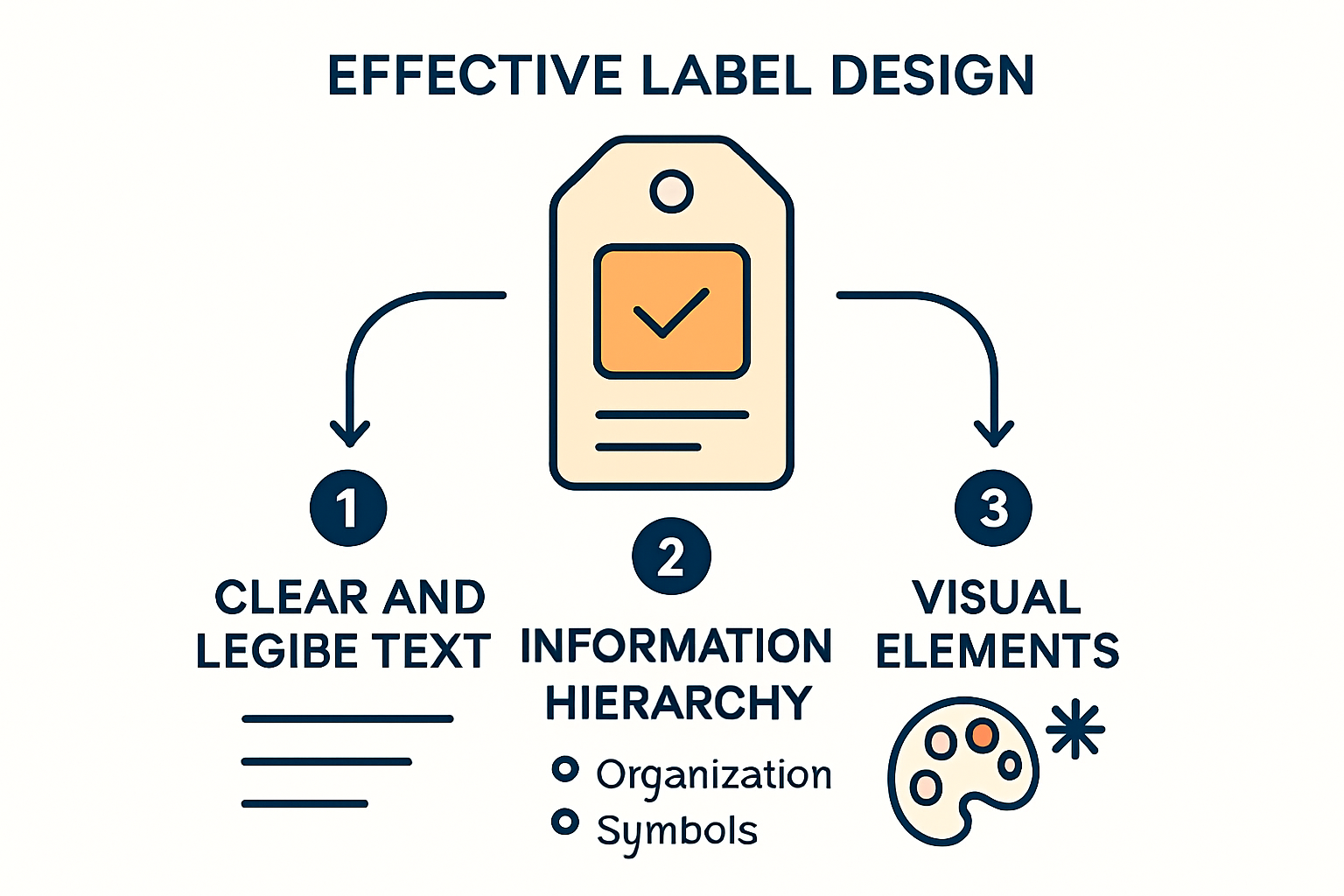
| Clear and Legible Text is Crucial | Use sans-serif fonts, ensure strong contrast and appropriate spacing to enhance readability, as clarity is often mandated by regulations. |
| Visual Elements and Colour Psychology Enhance Communication | Employ colours and symbols effectively to signal warnings, differentiate products, and guide attention, ensuring alignment with legal standards regarding misrepresentation. |
| Testing and Validation Prevent Costly Mistakes | Conduct thorough readability and environment simulation tests to identify potential issues before full-scale label deployment, significantly avoiding rework and operational delays. |
| Prioritise Information to Avoid Clutter | Maintain a clear hierarchy of information, focusing on essential details and regulatory requirements to prevent overwhelming users with excessive text or poorly structured designs. |
| Distinct Visual Design Prevents Errors | Implement clear differentiation strategies, such as unique colour systems and tall-man lettering, to avoid look-alike confusion between products, which is vital in high-stakes environments. |
Creating effective labels begins with understanding the essential design elements that make them both functional and compliant. Whether you’re labelling products for retail, industrial use, or pharmaceutical applications, certain fundamental components must be incorporated to ensure your labels serve their intended purpose.
The cornerstone of effective label design is text that can be easily read and understood. Text legibility isn’t just good practice—it’s often mandated by regulations. For instance, food labels in the UK must comply with specific requirements regarding font size and layout to ensure clarity for consumers, as outlined in UK food labelling regulations.
When designing your labels, consider these text elements:
A production line manager once told me, “If your operators need to squint to read a label, you’ve already failed in your design.” This practical wisdom highlights how essential legibility is in real-world applications.
Effective labels present information in a logical order of importance. This hierarchy guides the reader’s eye to the most critical information first, then to supporting details.
A typical information hierarchy might include:
For products requiring regulatory compliance, such as those needing the UKCA (UK Conformity Assessed) marking, specific rules regarding placement must be followed. The UKCA marking must be clearly visible, legible and indelible when affixed to a product, with specific requirements regarding size and dimensions. Until December 31, 2027, this marking can be placed on a label or accompanying document rather than on the product itself, according to UK government guidance.
Beyond text, visual elements play a crucial role in creating effective labels that communicate quickly and intuitively. Colours, symbols, and graphics serve multiple purposes:
Colours can:
Symbols provide instant recognition for:
When designing visual elements, balance is key. Overly complex graphics can distract from essential information, while insufficient visual cues may cause important instructions to be overlooked. Remember that UK regulations specify that product labels must not be misleading about quantity, size, materials, production methods, or product capabilities, as noted in government guidelines.
Production environments often require labels that can be quickly understood in fast-paced situations. One Pharmaceutical Production Manager explained, “In our facility, we use colour-coded borders for different product strengths—it’s a visual safeguard that prevents mix-ups even before reading the text.”
When creating effective labels, these design elements must work together harmoniously. The text must be legible, the information must be logically structured, and visual elements must enhance rather than detract from communication. By carefully considering these essential components, you’ll develop labels that not only meet regulatory requirements but also serve their practical purpose in identifying, instructing, and safeguarding—whether in a retail environment, industrial setting, or any other application requiring clear identification and information.
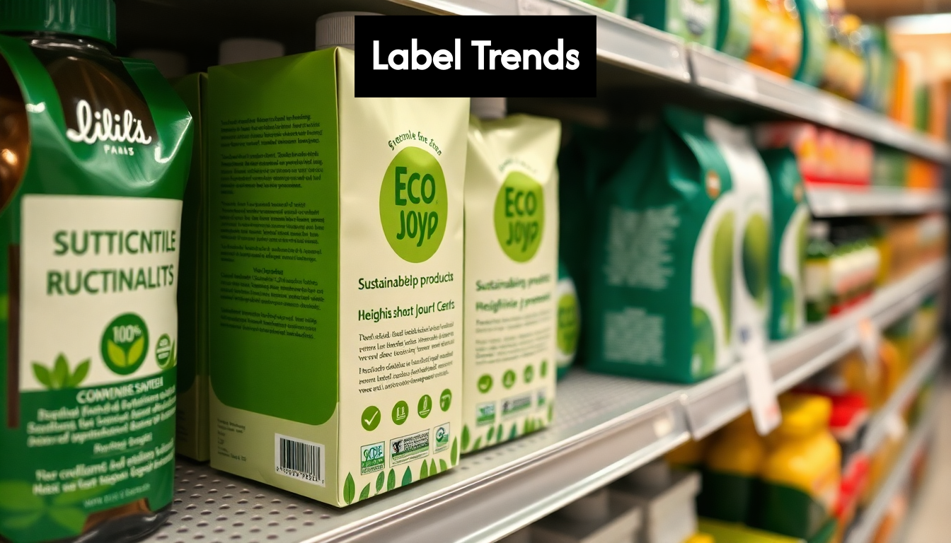
The landscape of label design is constantly evolving, responding to technological innovations, shifting consumer preferences, and emerging industry requirements. Understanding current trends can help you create effective labels that not only meet today’s standards but also anticipate tomorrow’s needs.
Sustainability has moved beyond a mere buzzword to become a fundamental consideration in label design. The UK’s sustainable labels market is projected to reach £18 billion by 2025, reflecting a significant industry-wide shift toward eco-friendly materials and processes, according to Sessions UK research.
This sustainability focus manifests in several ways:
“Our procurement team has seen a 40% increase in requests for sustainable label options over the past year alone,” notes a Procurement Officer from a major UK manufacturing company. “It’s no longer optional—it’s expected.”
For businesses looking to enhance their environmental credentials, integrating sustainability into label design offers a visible demonstration of commitment to responsible practices. Moreover, these sustainable approaches often align with cost-saving initiatives through material reduction and improved efficiency.
The intersection of physical labels and digital technology continues to create new possibilities for information delivery, authentication, and customer engagement. Smart labels incorporate elements that extend functionality beyond traditional printed information.
Prominent smart label technologies include:
These technologies enable unprecedented traceability, which is becoming increasingly important across industries. According to Loftware’s report on labelling trends, enhanced traceability features will be among the top trends through 2025, addressing growing demands for compliance and transparency.
For operations managers, these smart technologies offer valuable insights into product movement and condition throughout the supply chain. A Pharmaceutical Production Manager might use smart labels to verify that temperature-sensitive medications remain within safe parameters during transport and storage, while a small business owner might leverage QR codes to share detailed product stories that wouldn’t fit on a physical label.
While functional considerations remain paramount, the visual language of labels continues to evolve in response to consumer preferences and brand differentiation needs. An intriguing trend emerging is what design professionals call “Minimalist Maximalism”—a style anticipated to become dominant by 2025 according to Creative Boom’s industry forecast.
This approach combines clean, minimalist layouts with bold, eclectic colour choices and distinctive typography to create labels that are both orderly and expressive. The result balances clarity with visual impact—essential for standing out in crowded marketplaces.
Other notable aesthetic trends include:
For industrial and production environments, these aesthetic considerations might seem secondary to functional requirements. However, Product Development Engineers are finding that distinctive visual design can improve user compliance with critical instructions and reduce errors in product handling.
As automation in labelling processes increases—another key trend identified for 2025—the ability to maintain design consistency while accommodating greater variation and customisation will become increasingly valuable.
By staying attuned to these current trends in label design, businesses across sectors can create labels that not only serve immediate identification and compliance needs but also leverage emerging opportunities for sustainability, connectivity, and visual distinction. The most effective labels will thoughtfully incorporate these trends while maintaining focus on core communication requirements and operational practicalities.
Creating effective labels requires more than just understanding design principles and trends—it demands practical application of knowledge in real-world scenarios. Whether you’re designing labels for a production line, pharmaceutical products, or retail items, these actionable tips will help ensure your labels achieve their intended purpose.
Before implementing any label design across your entire product range, thorough testing can prevent costly mistakes and ineffective communication. Validation is particularly crucial in industrial and pharmaceutical settings where label clarity directly impacts safety and compliance.
Start with these practical validation approaches:
One Production Line Manager shared this experience: “We discovered our new label design was unreadable under our warehouse lighting only after printing 10,000 units. A simple light test beforehand would have saved us significant rework costs.”
Research supports the importance of thorough testing. Eye-tracking experiments confirm that specific design elements like bright colors and larger labels effectively capture attention among competing products, which is essential knowledge when designing for high-visibility environments. According to research on persuasive labelling, labels using bold lines, borders and stripes are viewed 42% more than plainer labels nearby, demonstrating how small design choices can significantly impact visibility.
Even the most well-designed label will fail if it’s positioned poorly on the product or in the environment. Consider the following placement strategies:
A Procurement Officer with experience in multiple industries noted, “The perfect label in the wrong location is just as ineffective as a poorly designed one. We’ve reduced picking errors by 23% simply by standardizing label placement across our inventory.”
Perhaps the most important practical aspect of creating effective labels is designing them to actively prevent errors. This is particularly vital in environments where mistakes can have serious consequences.
Studies in human-centered design show that specific label features can significantly reduce errors. According to clinical research, labels incorporating color differentiation between products, white backgrounds, avoidance of dangerous abbreviations, tall-man lettering (where selected letters are capitalized to distinguish similar-looking product names), and vertical text orientation substantially improve readability and reduce error rates.
Implement these error-prevention strategies in your labels:
A Pharmaceutical Production Manager explained their practical approach: “We implemented a triple verification system in our labels—color coding, numerical identifiers, and unique icons. Since then, our medication mix-up rate has dropped to near zero, even during high-pressure situations.”
By applying these practical testing methods, placement considerations, and error-prevention strategies, you’ll create labels that don’t just look good but actually perform effectively in their intended environment. Remember that label success isn’t measured by design aesthetics alone, but by how well they communicate necessary information to the right people at the right time, ultimately supporting operational efficiency and safety in your specific context.
Even with the best intentions, label creation can go wrong in numerous ways. By understanding and actively avoiding common pitfalls, you can save time, resources, and potentially prevent serious consequences. Let’s explore the most frequent label mistakes and how to circumvent them effectively.
One of the most prevalent mistakes in label design is trying to include too much information in limited space. This often results in cluttered, illegible labels that fail to communicate effectively.
According to museum curation experts, “Illegible or cluttered labels can undermine the effectiveness of the display.” While this observation comes from museum contexts, it applies equally to industrial and commercial labels. The same source recommends keeping text concise, using legible fonts, and avoiding excessive information which can overwhelm or confuse the reader.
Common manifestations of this mistake include:
“I’ve seen production lines halted because operators couldn’t quickly distinguish between similar product labels during changeovers,” explains an Operations Manager with over 15 years of experience. “The cost of that downtime far exceeded what we would have spent on properly designed, uncluttered labels.”
To avoid information overload:
Failing to meet regulatory requirements is perhaps the most consequential label mistake. Non-compliance can lead to rejected shipments, product recalls, legal penalties, and damaged reputation.
Non-compliance with legal labelling requirements—such as missing allergens, ingredients, or regulatory information—can render a label not just ineffective but unlawful in the UK, as heritage guidelines confirm. While these guidelines focus on museum contexts, the principle applies universally: required information must always take priority in label design.
Common regulatory mistakes include:
A Procurement Officer from the pharmaceutical sector notes, “We once received a shipment of raw materials with outdated hazard symbols. Even though the content was compliant, we had to quarantine the entire batch until new labels could be applied—a costly delay that could have been avoided.”
To avoid regulatory mistakes:
Label similarity between different products can lead to dangerous mix-ups and errors, particularly in high-stakes environments like healthcare, chemical handling, or precision manufacturing.
Research in healthcare settings has documented that poor label design, such as look-alike labelling or ambiguous layouts, significantly increases the risk of error. Clinical studies underscore the importance of clear differentiation and human-centred label design to avoid critical mistakes, particularly in medical settings where consequences can be severe.
This problem manifests in various ways:
“In our warehouse, we completely redesigned our chemical storage labels after a near-miss incident where similar-looking labels almost resulted in incompatible substances being mixed,” reports a Production Line Manager. “Now each hazard class has a distinct color background and icon system that’s identifiable from several meters away.”
To avoid look-alike confusion:
By strategically addressing these common label mistakes, you create labels that don’t just meet minimum requirements but actively support error prevention and efficient operations. Remember that the goal of effective label design isn’t merely aesthetic appeal but practical functionality in real-world environments. The investment in thoughtful label design pays dividends through reduced errors, enhanced compliance, and improved operational efficiency.
These practices are especially crucial for industrial settings, pharmaceutical operations, and production environments where label clarity directly impacts safety, compliance, and productivity. By avoiding these common pitfalls, you’ll create labels that truly serve their purpose—clear communication that supports your operational goals.
Effective label design should include clear and legible text, a structured information hierarchy, and visual elements that enhance communication. Prioritise font selection, size, contrast, spacing, and the use of colour psychology to convey the right message to consumers.
Sustainability can be achieved through the use of biodegradable materials, recycled content, and reduced material usage. Businesses are increasingly adopting eco-friendly practices in label production as consumer demand for sustainable products grows.
Common mistakes include information overload, regulatory non-compliance, and look-alike confusion. To avoid these, ensure that labels are uncluttered, meet legal requirements, and clearly differentiate between similar products using distinct visual elements.
Testing can be conducted through readability tests, environment simulations, and assessments for colour vision deficiency. These techniques help identify potential issues before finalising your label, ensuring it communicates effectively in real-world conditions.
Creating effective labels is crucial in today’s fast-paced manufacturing landscape, where accuracy and clarity can mean the difference between success and costly mistakes. As highlighted in our ultimate guide, an effective label must not only comply with regulations but also communicate vital information clearly. Are your labels living up to their potential?

At Sessions UK, we provide the cutting-edge labelling solutions to help you address these challenges head-on. From semi-automatic desktop machines perfect for small businesses transitioning from hand-labelling, to fully automatic floor-standing machines designed for high-volume operations, we’ve got the right tools for your needs. Our products ensure precision, mitigate risks, and enhance your brand’s presentation—helping you avoid the pitfalls of information overload and regulatory non-compliance.
Don’t let poor labelling hold you back! Harness the power of our labelling technology today by visiting https://sessionsuk.com and discover how we can not only meet but exceed your operational goals. Your success story starts with the right equipment—let’s get started!

Designing a Line Layout That Delivers Real ROI Planning a new line layout around automated labeling machines is one of the smartest moves a manufacturer...

Tamper-evident labels can do far more than sit on a lid and show if something has been opened. When they are chosen and used in...

Unplanned stoppages on a labelling line do more than slow things down. They hit output, cause stress on the line, and can even put product...
Copyright © 2026 Sessions Label Solutions Ltd.